Some Great Examples of Retail Design
What are some of the greatest store interiors across the world?
Good store design is not just about getting it right in terms of utilising retail space effectively. It needs to meet the needs of the retailer, promote enjoyable and stress-free shopping as well as create a design impact that encourages consumers to give their loyalty to a store or brand. For interior designers, this is no easy task and breaking conventions as well as making sure customers are not too far out of their comfort zone is a balance that can be hard to maintain. However, there are times when designers get it spot on and listed below are some great examples of store design, including explanations as to why exactly they’re so successful.
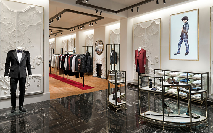
Alexander McQueen Flagship Store, London
This flagship store, located in London’s exclusive Mayfair neighbourhood, makes it onto the list because it brings together ease of use and innovative design features. It was designed by Sarah Burton, who is currently the creative director of the brand, and the David Collins Studio, one of the world’s leading luxury interior design companies. The store is situated in a Georgian townhouse, covering 3000 square feet spread over three floors. In terms of product placement, the entire McQ collection is displayed in an art gallery museum style, making it easy for consumers to view and ultimately purchase the clothing. This also highlights the artistic nature of the brand, which is followed throughout the store with a mixture of surrealist, boudoir and brutalist design features throughout.
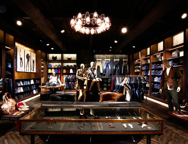
The Diesel clothing brand is often known for their interesting and innovative design features in stores across the globe. While the Tokyo flagship store saw futuristic giant rolls of aluminium, the Brussels store took on a more earthy approach to its retail design. The design itself is relatively simple, with African-inspired wood, leather and exposed brick being the main components; however it is in the ease of customer journey where this store really shines. Clothing is well displayed, well lit and easily accessible for customers, meaning the consumer journey promotes purchase making. This was something that the Tokyo store was unable to achieve as the aluminium rolls made for accessibility problems.
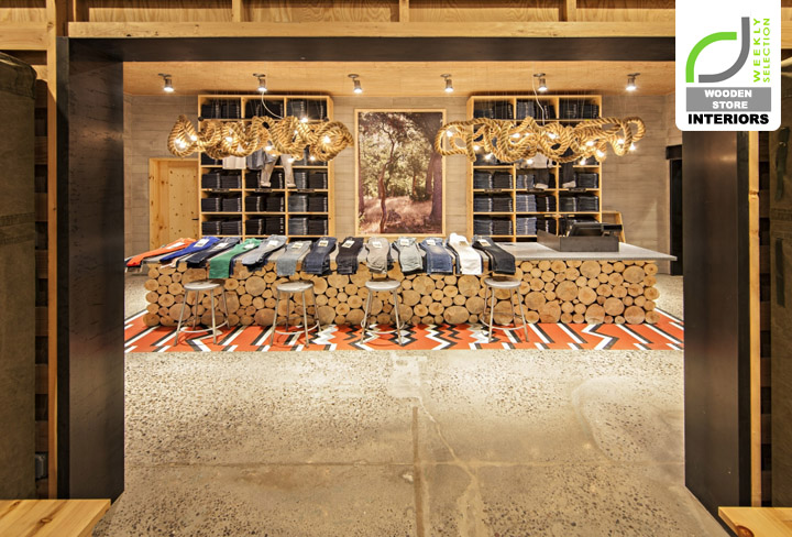
Levi Strauss & Co, New York
This store is a great example of how retail design can really match and enhance a brand’s image. The Levi brand is often associated with the outdoors, so the iconic store in New York makes use of wood as the primary material for its retail design. Display tables are made from roughly sawn logs, dressing rooms are made from linen tents and lights hang from twisted ropes, which all adds to the rustic yet industrial feel. The space was designed by MBH Architects, who aimed to display the Levi products in a consumer friendly way as well as create a memorable impact with their wooden store.


